
Black Friday and Cyber Monday set mobile shopping records
It’s Tuesday, November 28, and the internet can finally take a much-deserved break from the hectic (extended) weekend. Black Friday and Cyber Monday — two of the most significant shopping days in North America — have officially concluded and the numbers prove just how much we love our shopping. As of last night at 10 pm eastern time, online sales from Monday alone reached 6 billion dollars, and that’s only online! Forbes has already stated that Cyber Monday became the single largest online shopping day in U.S. history. Also, Thanksgiving day saw 2.87 billion and Black Friday 5.03 billion in online sales.
All of this is great. People are avoiding the annual Wal-Mart boxing match by doing their shopping online. Online shopping is relaxing and stress-free. When you shop online or on your phone, you don’t have to deal with other shoppers fighting for breathing space. Buying online means buying in comfort, and this has never been easier with retailers focusing on developing sound e-commerce websites and mobile apps.
Mobile, which has traditionally been a place that’s seen e-commerce graveyards, made a statement over the weekend. Smartphone revenue grew 32.2 percent from last year, reaching $1.59 billion, a new all-time high. Overall, mobile represented 47.4 percent of visits (39.9 percent smartphones, 7.6 percent tablets) and 33.1 percent of revenue (24.1 percent smartphones, 9.0 percent tablets) (via Forbes). For purchases made on smartphones, Apple iOS led with average orders ringing in $123, in comparison to Google Android at $110.

What this means for the future of mobile shopping
The stats don’t lie. People are becoming more and more comfortable completing shopping orders on their smartphones and this means that e-commerce companies cannot solely rely on a desktop website to maximize the customer experience. If a company chooses to focus on a mobile-responsive website or mobile app, they first need to consider the user experience (UX) and user interface (UI).
Speed: Make sure your website is fast. There is nothing worse than trying to shop on your phone with an excellent WiFi connection only to sit waiting for the browser to load. If a user is waiting for more than a few seconds, chances are you’ve lost that potential customer. In a previous blog post, we stated that “mobile pages that are 1 second faster experience up to 27% increase in conversion rate.” With online sales on the rise, now is the perfect time to invest in a speedy website.
Alternatively, investing in a mobile app will put the speed problem behind you. Mobile apps are far faster than websites as their data and information are stored right on the phone. With web pages, the products and data have to be pulled from the browser. Further, if you invest in a high-quality mobile app, you should be able to offer offline support so users can build their shopping cart without wifi, and complete the order when they have a connection.
UI/UX: You’ve managed to get the user to your online store, good. Assuming your website speed is in check, now you need to ensure you have the optimal user interface and user experience. To start, make sure your website is mobile-responsive! It’s 2017 for goodness sake. If you expect to get online sales via smartphones with a non-adaptive page, you’re in for a sad awakening. Some things to consider: What is the landing page? How does a user navigate between items and their shopping cart? Does my shopping experience include unnecessary clicks? It helps to imagine the process a shopper would go through from start to finish. If you optimize your mobile experience, you increase your chances of that user coming back for more shopping in the future.
Case Study: From social media to the online store
Social is one of best ways of getting users to access your mobile store. Why? The user is most likely already on their smartphone, making the transition to a website easy. Paid ads can be set up that promote a sale or product and easily transition the user from the social platform to the online store with minimal clicks.
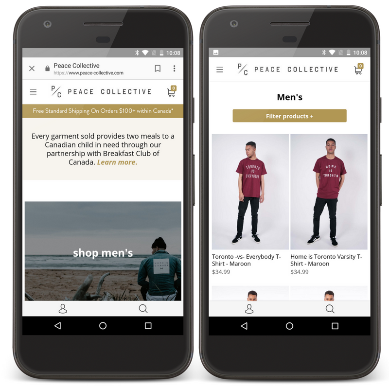
On Cyber Monday, I experienced this situation first hand. On my way to work in the morning, I was scrolling through Instagram only to come across an ad from Peace Collective, a Toronto-based clothing company. From Instagram, Peace Collective caught my interest promoting their massive one day sale. When I clicked on the ad, I was directed to a first-class mobile experience. Peace Collective’s mobile interface is extremely easy to navigate, it only took me a few clicks to confirm my order, size, etc. Their mobile pages are full of eye-catching graphics, and make it simple to filter products according to individual needs. Peace Collective understands how valuable the user experience is, especially when pulling your customers from social media. In the end, I purchased a sweater on their mobile store for just $15 (with free shipping) and even recommended Peace Collective to my friends later that evening.
Mobile Shopping Heading into 2018
If your mobile sales aren’t even near your desktop sales, consider investing time and money into a sound mobile UI/UX. We can expect that 2018 will see continued mobile e-commerce growth, especially as companies recognize the significance of the user experience. Don’t fall behind in the mobile trends, make sure you optimize your mobile e-commerce website before it’s too late!
Share This Article